 TetraKits
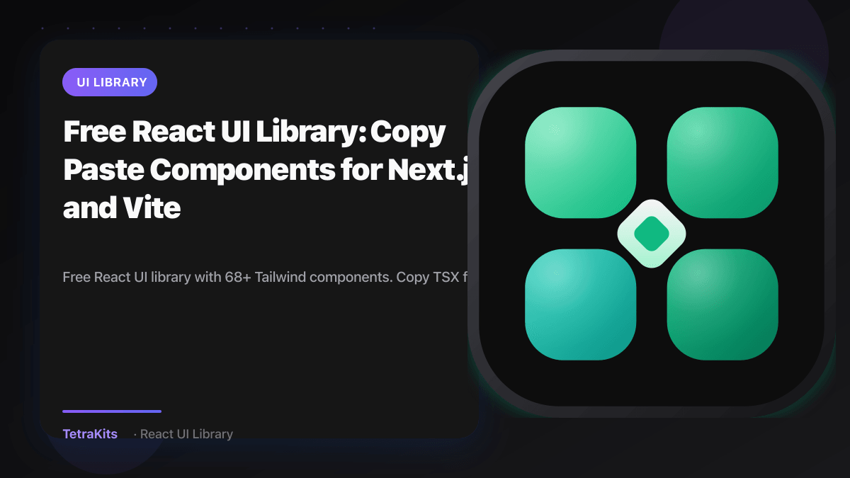
TetraKits now ships a free React + Tailwind UI library alongside our QR, PDF, and calculator tools. Browse 68+ copy-paste components with heroes, GSAP motion footers, bento grids, buttons, backgrounds, and CTAs. Every page includes live previews, TypeScript source, npm install notes, and AI prompts for Cursor, Copilot, and ChatGPT.
Overview
Whether you are building a SaaS landing page, a startup marketing site, or prototyping in Cursor, TetraKits UI gives you production-ready blocks without signing up or cloning a heavy design system. Every component page includes:
- Live preview: desktop and mobile viewport toggles
- Copy-ready TSX: paste into Next.js, Vite, or Remix
- Dependency notes: e.g.
framer-motion,gsap,lucide-react - AI prompt tab: structured instructions for coding agents
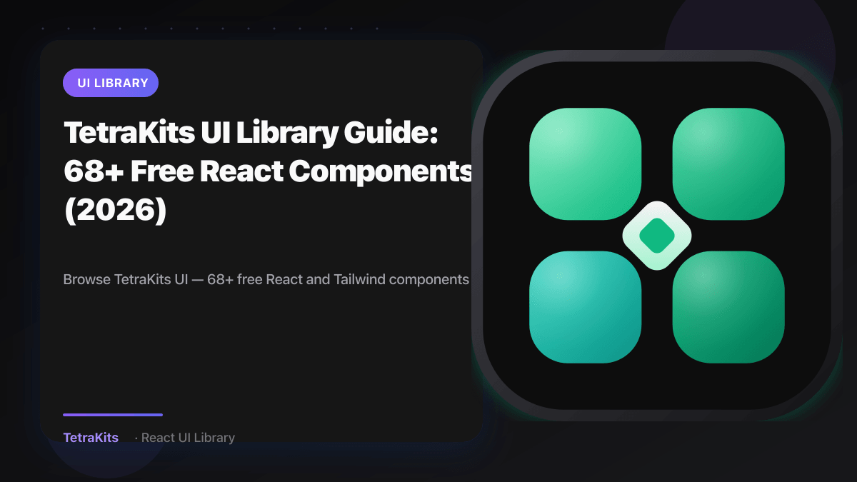
What's in the library
The library spans nine categories and grows with 21st.dev-inspired patterns rebuilt for TetraKits branding:
- Footers: GSAP ScrollTrigger motion footer with magnetic glass pills and aurora grid
- Features: dark bento grids, split layouts, and Magic UI-style blocks
- Heroes: aurora SaaS, minimal startup, and split product headers
- Buttons: rainbow pill, shiny shimmer, ghost outline, and pulsating neon
- Backgrounds: animated grids, starfields, aurora mesh, and CRT scanlines
- Announcements, CTAs, cards, pricing: marketing blocks ready to drop into any page
How to use a component
- Open the library. Start at the TetraKits UI hub or jump to a category like Footers or Features.
- Pick a component. Click any card to open its detail page with live preview.
- Install dependencies. Run the listed
npm installcommand (e.g.npm install gsapfor motion footers). - Copy TSX. Use the Source tab, or copy the AI Prompt tab into Cursor to adapt colors and copy to your project.
- Ship. Components use Tailwind CSS classes and standard React patterns with no proprietary runtime.
Browse by category
- Hero Sections for landing page headers
- Footer Components with motion, neo-minimal, and wordmark layouts
- Feature Sections with bento grids and split blocks
- Button Components with animated CTAs and Framer Motion
- Background Components for full-page animated backgrounds
- Announcements with pills, banners, and promo strips
Frequently asked questions
Is TetraKits UI free?
Yes. All components are free to copy and use. Many are MIT-friendly patterns adapted from the 21st.dev ecosystem with TetraKits content and palettes.
Do I need an account?
No signup required. Browse, preview, and copy source directly in your browser.
Which frameworks are supported?
Components are written in React + TypeScript with Tailwind CSS. They work in Next.js, Vite, Remix, and other React stacks.
Can I use components with AI coding tools?
Yes. Each component page includes an AI Prompt tab with install instructions, placement guidance, and the full TSX source formatted for Cursor, Copilot, or ChatGPT.
How is this different from TetraKits tools?
TetraKits tools (QR, PDF, calculators) are browser utilities. TetraKits UI is a developer component library for building websites and apps. Both live under tetrakits.com.